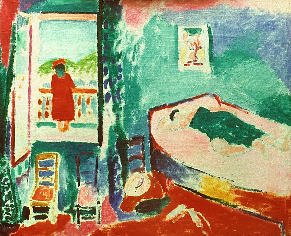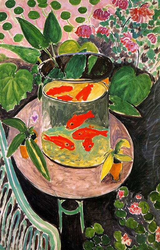
Was Matisse a Neuroscientist?: Henri Matisse was a master of the Modernist movement. His art exploded with colors, leading one outraged critic to exclaim, “A pot of paint has been flung in the face of the public!”. If you have ever tried to paint, you quickly learn (to your chagrin) that the bright red that looks so good when you first apply brush to canvas becomes disappointingly different when you paint in the background. The brain “mixes and muddles” adjacent colors. So what was Matisse’s secret?
• Achromatic shielding: Notice that Matisse leaves portions of the raw canvas untouched. These white (or black lined) regions separate different colors, insulating them against chromatic induction, and allowing him to use vibrant, saturated colors, often straight from the tube. To see illusions of color changes depending on the surrounding colors: http://goo.gl/SWFJ7
• Color perception: Starting with cone-shaped photoreceptor cells in our retina, electrical signals travel to at least five different cortical regions where they are decoded and interpreted based on complex calculations and prior experience before being assigned a color. No wonder that neuroscientist Eric Kandel said, “a painting isn’t complete without its beholder,”
• Matisse understood the importance of achromatic shielding. He said, “If upon a white canvas I set down some sensations of blue, of green, of red, each new stroke diminishes the importance of the preceding ones. Suppose I have to paint an interior: I have before me a cupboard; it gives me a sensation of vivid red, and I put down a red that satisfies me. A relation is established between this red and the white of the canvas. Let me put a green near the red, and make the floor yellow; and again there will be relationships between the green or yellow and the white of the canvas which satisfy me. But these different tones mutually weaken one another. It is necessary that the diverse marks [signes] I use be balanced so that they do not destroy each other.” Color shielding comes with a cost: Matisse’s paintings appear flat, sacrificing depth for hue.
Read more: http://goo.gl/f1jLJ
Ref: Color consilience: color through the lens of art practice, history, philosophy, and neuroscience. Bevil R. Conway (2012) Annals of the NY Acad. Sci. DOI: 10.1111/j.1749-6632.2012.06470.x